The MM Group brings together two business divisions under one roof, each operating in its own markets and addressing entirely different target groups. MM Board & Paper is Europe’s largest producer of cartonboard, it has a high-quality paper range and targets the printing and converting industries. MM Packaging supplies a wide range of sectors, from the pharmaceutical and food industries to manufacturers of luxury goods and indulgence products. This a division specializes in designing sustainable packaging that convinces through innovative functionality and appeals to users both visually and tactilely.

Over time, both divisions had refined the corporate design in their own way, making the uniform use of templates and content difficult and resulting in an inconsistent outward image. Additionally, there were no unifying graphic elements or clear visual language to demonstrate the affiliation of the two divisions under the umbrella of the MM Group.
The decision to make the brand more future-proof and position it more clearly around the topic of sustainability led to the desire to revise the design, with two objectives: first, to make the distinction between the two divisions clearer and enable a differentiated approach, and second, to maintain a visually recognizable link to the MM Group.

Squaring the circle as a design mission
One of the client’s key wishes was to develop the existing design with great care. “Be careful, don’t touch the logo, develop the design discreetly and ensure that the appearance is functionally easy to implement” was the guiding principle of the brief. However, a comprehensive analysis of the competition revealed an uncomfortable truth: there was little to be gained from exercising restraint. This was especially true in MM Packaging’s market segment, where the division competes with manufacturers of perfumes, luxury items and other premium products, making an eye-catching, emotionally appealing image vital for captivating target groups.
How can this problem of seemingly squaring the circle be resolved? How can a design be created that fulfils both the desire for restraint and the need for a strong visual presence?
![]()
In collaboration with our colleagues at Lekkerwerken, we found the answer in the MM Group’s own DNA: “Think Next.” This guiding principle served as our compass to break free from creative restraint and develop a design that meets both aesthetic and functional requirements. It also gave us the courage to literally “square the circle”. The existing logo circle was deconstructed into “individual components” and then reassembled. The geometric intersections of the circle and square can be used to create new patterns that cannot deny their common origins, even when using different colour schemes.

A modular design system for every need
Based on these elements, we developed a modular design system. With carefully thought-out colour codes, flexible design elements and logically defined grids, we created a visual identity that clearly distinguishes the two divisions while simultaneously reinforcing their connection to the MM Group. A uniform logo for the entire group combined with a new, expressive typeface ensures clear recognizability. The colours clearly differentiate the divisions while remaining visually coordinated to maintain a consistent brand identity. This system is versatile and can be seamlessly applied across all communication materials, from digital applications to complex packaging designs.

![]()
Identifiers as distinguishing features
Identifiers for the MM Group and the two divisions guarantee recognition across all communication materials through abstract symbolism and clearly assigned colours. The MM Group retains the circular element from its origins, while two horizontal bars symbolize the paper and cartonboard layers of MM Board & Paper’s products, and at MM Packaging a rotated box visualizes the division’s packaging core competence.

The colour scheme and system of geometric elements not only facilitate orientation for external target groups, but also make it easier for employees to work with the design. To demonstrate how the new design can be implemented efficiently and consistently — whether for simple communication media or sophisticated packaging designs — we documented the design elements in a comprehensive style guide that not only defines the fundamentals, but also provides numerous usage examples.
… and action! Transferring the design from concept to reality

How well a design works can only be seen in actual use. The leading international trade fair "Fachpack 2024" became our proof of concept, where the new design had the opportunity to demonstrate that it could achieve the desired success. Alongside the design kit, we developed numerous communication materials, including product flyers, sample books and packaging designs, to continue convincing customers after the trade fair ended. The flexibility of the design system was also reflected in its aesthetic adaptability for the three-dimensional space. This made the trade fair a brilliant launch of the new brand identity, which inspired the employees at the booth and filled them with pride.

To ensure that this effect could take hold, we first had to get employees and managers throughout the company excited about the new look and feel and win them over:
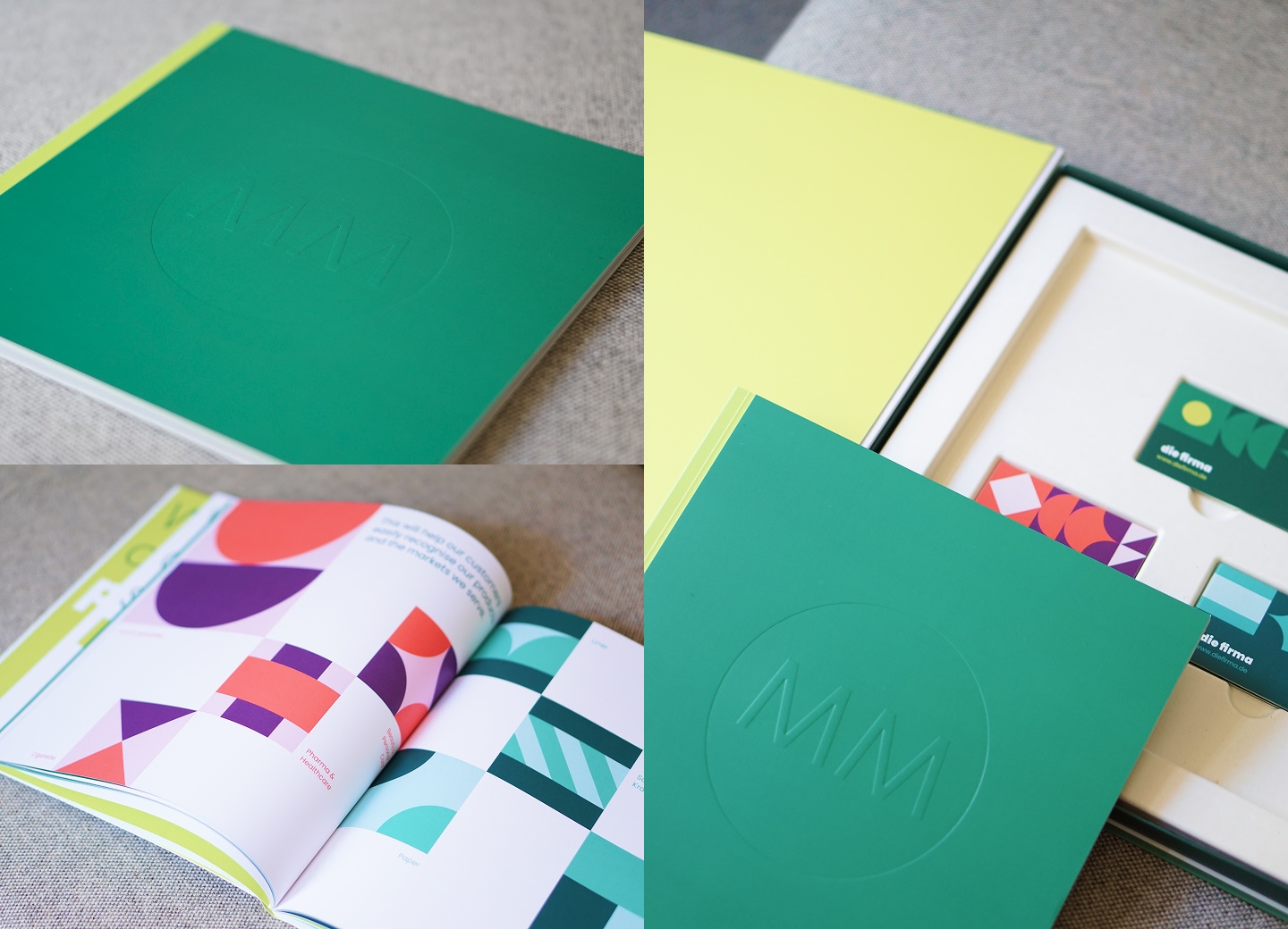
Coffee table book
To get management on board and illustrate how the new design philosophy aligns with corporate strategy, we designed a high-end book that tells a new brand story. Packaged in an elegant gift box, the coffee table book not only serves as a stylish and valuable tool for internal presentation purposes, but also as an exclusive gift for customers.
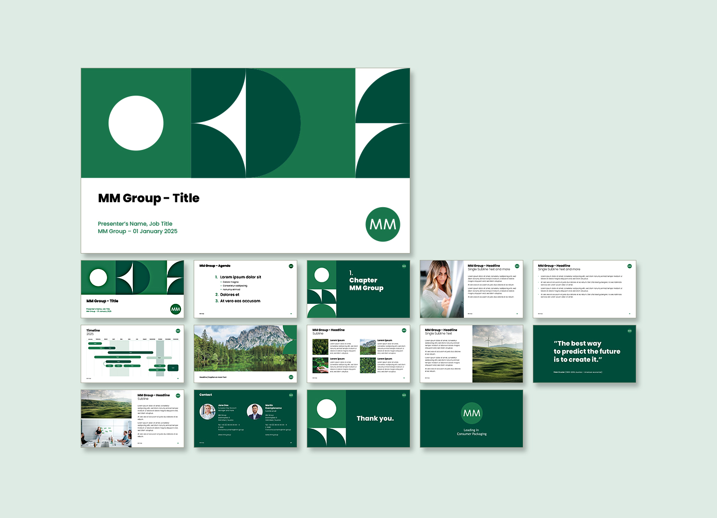
PowerPoint slide master
The new PowerPoint presentation posed a particular challenge from a technical perspective. For consistent and flexible presentations, we developed a modular slide master that can be easily customized and combined. What makes it special is that the content is retained, while the colours automatically adjust according to the division using the templates — a time-saver for all teams that ensures they enjoy working with the presentation master slide.
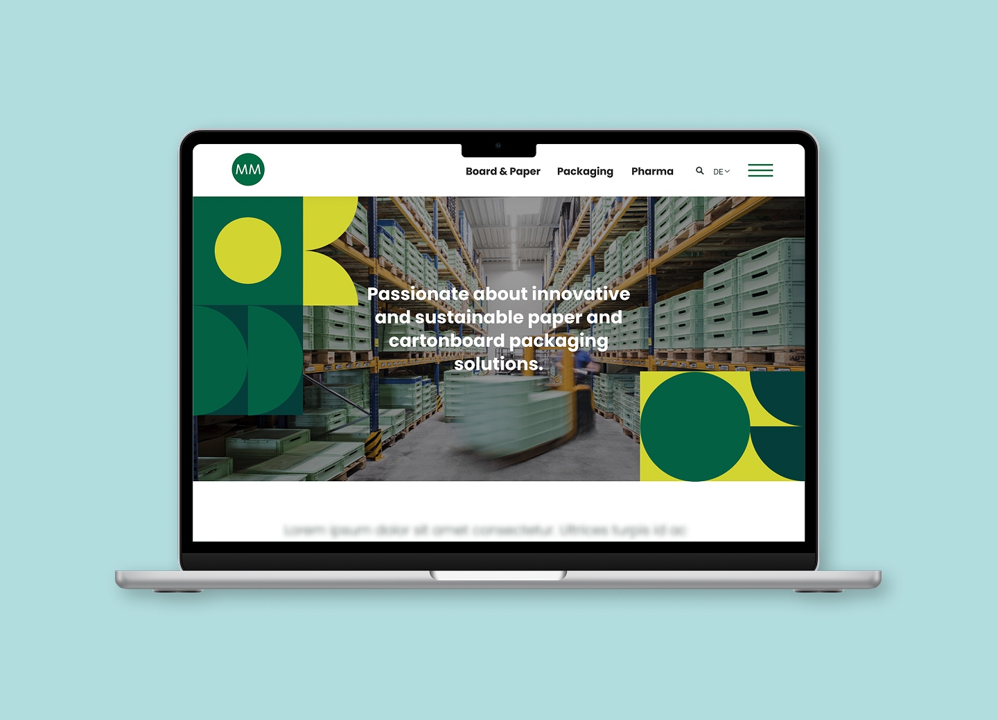
Website
Naturally, the website was also adapted to the new design in time for the trade fair and designed in such a way that it can be gradually expanded to meet growing requirements.
Brand introduction video
Based on the brand book, the story behind the new design is told through an appealing animated video that engages employees and dynamically conveys the most important aspects of the design. Thanks to its adaptable format, shorter clips of the video are also suitable for social media, giving customers and other stakeholders a first impression of the new brand identity.
https://www.youtube.com/watch?v=wD4InU4mwY4
Think next – MM Group brand redesign unveiled.Using AI to create a unique visual language
With the aim of creating a distinctive visual language that complements the new design and supports both internal and external communication efforts, we developed visual concepts for both divisions that perfectly reflect the innovative spirit of the MM Group. AI assisted us in this process.

„Inside the Box“
This approach focuses on the box as a general metaphor for packaging. Using AI, we created visuals that present MM Packaging’s packaging and product worlds on a three-dimensional “box stage”, transporting viewers into a wide variety of product worlds, from food to beauty to pharmaceuticals.

„Paper Types“
This idea, developed for MM Board and Paper, gives the product lines a face. Using AI-generated paper characters, each product brand became a living “character” that represents the distinctive paper or cartonboard quality. This creative approach was enthusiastically received and expanded upon.

Inspired by this “personification”, the marketing and sales team brought the characters to life at an internal sales event with actors in costume — to the great delight of all attendees. For us, this was the highest compliment of all, and proof of how motivating a new design can be.

Conclusion: Design that transforms
A well-conceived design does far more than simply strengthen the brand image externally. It can initiate change within a company, spark new motivation and encourage employees to identify with the brand. The key lies in a strategic approach: when design aligns with the company’s values and aims, employees can make it their own and actively integrate it into their daily work.
When employees understand how design makes their work easier and strengthens the brand, an entirely new dynamic emerges. A strong, strategically anchored design is not only a communication tool, but also a powerful instrument for shaping corporate culture.