The story of how I came to this conviction is a few years old and (unfortunately) typical of the industry in which I work: A development team was entrusted with the task of relaunching an extensive information and community portal. The process was supposed to be extremely difficult. Although some layouts for the new look & feel were available - of course already finalized - there was no complete overview of the basic building blocks that made up the site at that time.
To be able to complete the job from a purely quantitative viewpoint, the individual areas of the page were divided up and assigned to different developers. Shortly after the start of implementation, the developers handed over a new final layout document. It wouldn't be the last final version. Each new iteration increased the difficulty of ensuring that all project participants were informed about the latest adjustments and improvements.
Two weeks later, 80% of the new templates were completed and the stylesheets several thousand lines long. At first glance everything looked quite tidy, but the devil was in the details.
 19 shades of blue and grey
Due to the lack of transparency and synchronisation of the changes in the templates and the incomplete analysis of all necessary basic elements of the site, individual areas of the website developed independently of one another. The example shows a list of various shades of grey and blue - likely extracted from layout templates - which are all very similar. After the site launched, this situation continued to worsen. With each new extension, it became more difficult to determine which components could be reused. The result was a website with an inconsistent appearance and high maintenance needs.
I have had similar experiences in projects in which an elaborately designed “classic” style guide was developed in advance. These documents are often implemented with the best of intentions and meticulous attention to detail. However, they lack a connection to the actual context of use: the browser. With each further development step, it becomes less likely that these style guides will be maintained. Six months after launch at the latest they exist as style guide zombies in the dark corner of a fileserver.
A better approach: Living style guides
A project like the one described above would have even more drastic consequences nowadays. The number of different devices and screen resolutions that we need to consider when developing digital products today makes consistent and adaptable design systems ever more necessary.
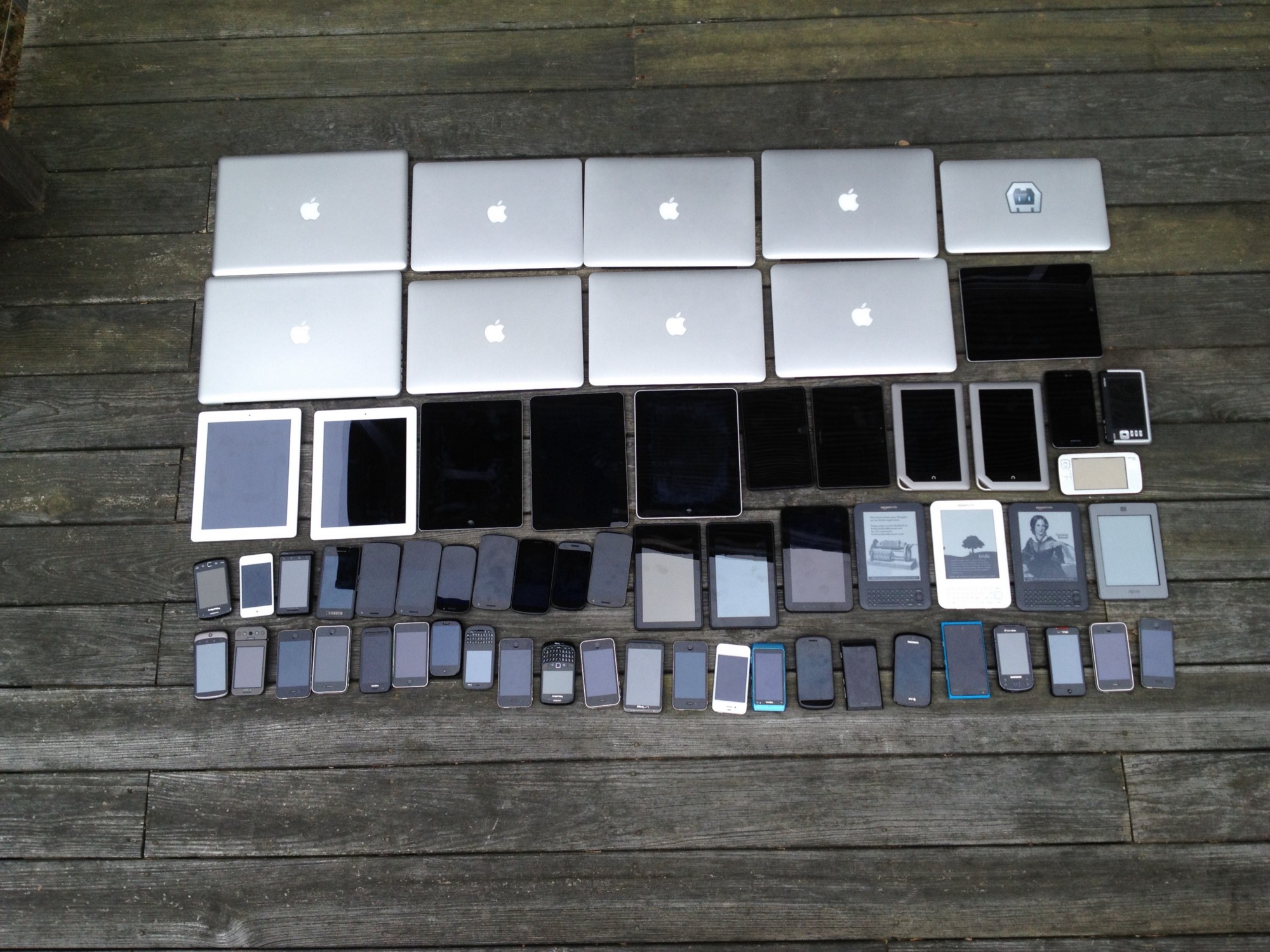 One design - a variety of devices (source: https://www.flickr.com/photos/brad_frost/7387827018/in/album-72157630163121422/)
Fortunately, there are ways to prevent such a worst-case scenario:
- No waterfall structures: Creatives, information architects, developers and content strategists work together on the design system from day one.
- Rapid prototyping: Design prototypes get into the browser as quickly as possible to test their responsiveness, performance, usability and interactivity.
- Single source of truth: In the design process, there is a central source that makes the latest development status available to all project participants, creating transparency.
Living style guides are the perfect tool for such an approach. They are right at the place where creatives, developers and information architects interact, and they give everyone involved a common platform. As a central reference, they provide binding information about the structure and style of all elements used. They are usually based on classic web technologies (HTML5, CSS, JavaScript), they can be easily integrated into content management systems and, in many cases, they are compatible with git - the industry standard when it comes to version management. This makes them ideal for coordinating decentralized teams.
Working with living style guides facilitates the reuse of modular building blocks, accelerates processes when adjustments are necessary, and ensures that the documentation of the digital product is always up-to-date.
Spoilt for choice
The website styleguides.io offers a good overview of a variety of tools suitable for the work method described above. The best-known ones at present are Frontify, Fractal, SourceJS and Pattern Lab. Some of the tools presented use different technologies and differ in their operation and the processes behind them. Our company has been working with Pattern Lab for some time, a system based on the Atomic Design principles of Brad Frost.
Atomic Design is based on a modular design system comprising five evolutionary stages:
Atoms: the smallest possible controls of a page, like a progress bar
 A progress bar atom (source: http://demo.patternlab.io/?p=atoms-progress)
Molecules: simple combinations of several atoms, such as a tile with progress bar and text
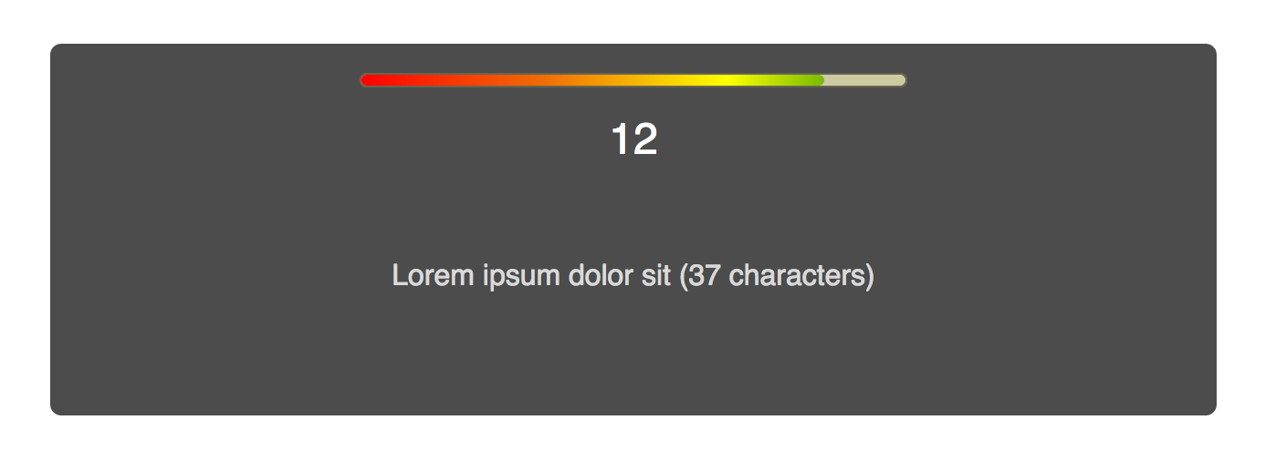 A tile element as a molecule (source: http://demo.patternlab.io/?p=molecules-block-tile)
Organisms: more complex accumulations of atoms and molecules, such as a grid of several tiles
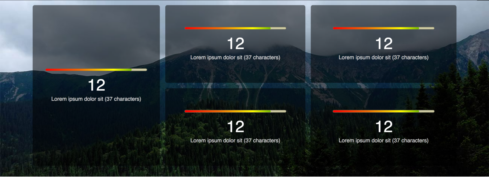 A grid of several tiles as an organism (source: http://demo.patternlab.io/?p=organisms-style-grid)
Templates: a page template composed of several organisms
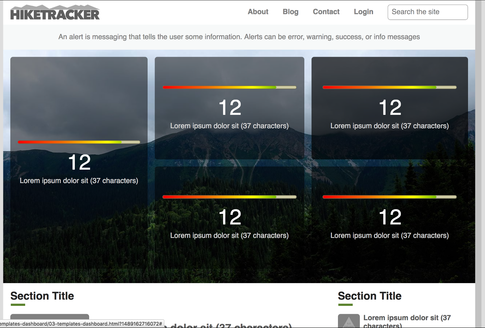 A template (source: http://demo.patternlab.io/?p=templates dashboard)
Page: The full version of a page based on a template with real texts and media elements
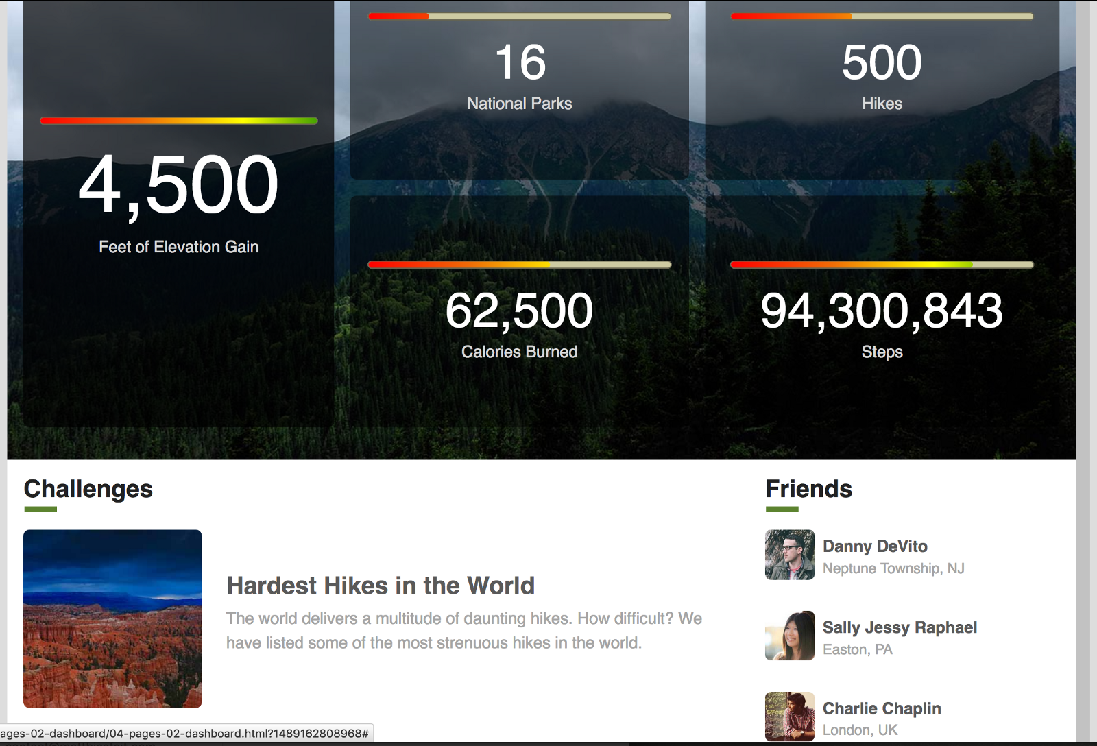 A full-featured page (source: http://demo.patternlab.io/?p=pages dashboard)
Such a structure makes it possible to collaboratively develop a very coherent and expandable system of page elements in the shortest possible time with the help of everyone involved.
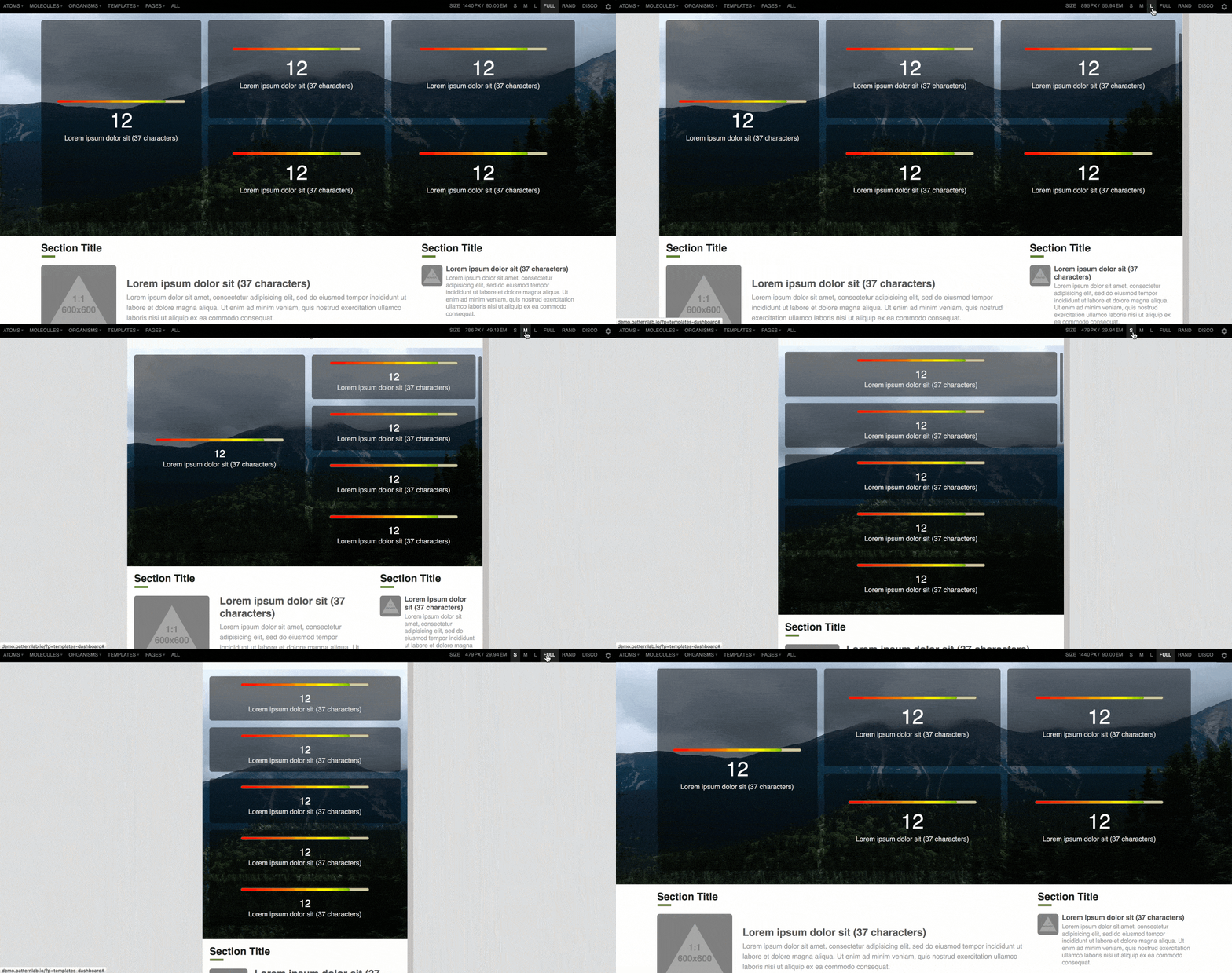 Testing responsive design directly in Patternlab
All project participants can make joint decisions on dimensions, distances, colours and typography under realistic conditions. Such a system also conveys the intended look & feel much better than a static document by using animation, user interaction and responsive behaviour at different breakpoints (see graphic). This provides transparency in the quality assurance process and gives stakeholders additional security.
Bring your style guides to life Companies that want to build a digital ecosystem that grows sustainably need tools that enable their interdisciplinary teams to meet the constantly changing demands on digital services. Living style guides are the perfect tool to move forward with these goals.
Some best practices
If you are interested or have any questions, please do not hesitate to contact us: call +49 (0)611 . 238 50 10 or by eMail to kontakt(at)diefirma.de.
